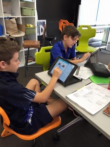
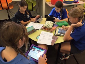
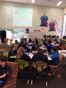
The Year 6 students have been learning about our neighbouring countries in Geography. To support their understanding regarding the differences between Australia and some of these countries, we are supporting them to create an infographic on a country from a list we have given them.
To do this, they will need to gather data and then to understand what it means in order to be able to represent it in a visually appealing way as an infographic.
In terms of the Digital Technologies Curriculum, this learning experience is meeting this content descriptor:
Acquire, store and validate different types of data, and use a range of software to interpret and visualise data to create information (ACTDIP016)
The students initially discussed the value of infographics and investigated themselves what made an effective infographic. They worked in groups to find a collection of them to save into a shared folder within Showbie so the class could look at them together to compile a list of rules for effective infographics.
Following this lesson, they were given a model data collection sheet with the information already completed. They discussed the meaning of the data and how it compared to Australia’s data. They then were introduced to Canva as a means of creating the infographic. Exploration time was then given as they looked at the functions within Canva to represent the data they had been given.


